1👍
You can trim the labels depending on the screen width, like so
Chart.types.Bar.extend({
    name: "BarAlt",
    initialize: function (data) {
        var originalLabels;
        // figure out the best label length for the current window size
        if (this.options.responsiveLabelLengths !== undefined) {
            var maxLabelLength;
            this.options.responsiveLabelLengths
                .sort(function (a, b) {
                    return b.uptoWidth - a.uptoWidth;
                })
                .forEach(function (spec) {
                    if (screen.width < spec.uptoWidth)
                        maxLabelLength = spec.maxLabelLength;
                })

            // update the labels if required
            if (maxLabelLength !== undefined) {
                originalLabels = Chart.helpers.clone(data.labels);
                data.labels.forEach(function (label, i) {
                    if (data.labels[i].length > maxLabelLength)
                        data.labels[i] = data.labels[i].substring(0, maxLabelLength) + '...';
                })
            }
        }

        Chart.types.Bar.prototype.initialize.apply(this, arguments);

        // optional - now restore the original labels for the tooltips
        if (originalLabels !== undefined) {
            this.datasets.forEach(function (dataset) {
                dataset.bars.forEach(function (bar, i) {
                    bar.label = originalLabels[i];
                })
            })
        }
    }
});


var data = {
    labels: ["Really Really Really Really Really Long Text", "February", "March", "April", "May", "June", "July"],
    datasets: [
        {
            label: "My First dataset",
            fillColor: "rgba(220,220,220,0.5)",
            strokeColor: "rgba(220,220,220,0.8)",
            highlightFill: "rgba(220,220,220,0.75)",
            highlightStroke: "rgba(220,220,220,1)",
            data: [65, 59, 80, 81, 56, 55, 40]
        },
        {
            label: "My Second dataset",
            fillColor: "rgba(151,187,205,0.5)",
            strokeColor: "rgba(151,187,205,0.8)",
            highlightFill: "rgba(151,187,205,0.75)",
            highlightStroke: "rgba(151,187,205,1)",
            data: [28, 48, 40, 19, 86, 27, 90]
        }
    ]
};

var ctx = document.getElementById("myChart").getContext("2d");
var myLineChart = new Chart(ctx).BarAlt(data, {
    responsiveLabelLengths: [
        {
            uptoWidth: 480,
            maxLabelLength: 5
        },
        {
            uptoWidth: 768,
            maxLabelLength: 10
        },
        {
            uptoWidth: 992,
            maxLabelLength: 20
        },
        {
            uptoWidth: 1200,
            maxLabelLength: undefined
        },
    ]
});
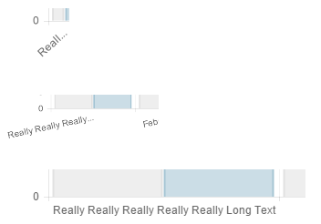
Since we are using screen width you need to use Chrome Developer tools and choose a proper viewport sizing to see the effect. For the same reason, this is not going to have any effect if you are resizing your window – if you need that, just replace screen.width by window.innerWidth.
To add this as a new directive to angular-chart is pretty simple. After the above block of code (and after the script include for angular-chart.js) add a new directive for BarAlt, like so
angular.module('chart.js')
    .directive('chartBarAlt', ['ChartJsFactory', function (ChartJsFactory) { return new ChartJsFactory('BarAlt'); }]);
Then use the directive like so
<canvas id="line" class="chart chart-bar-alt" data="data" options="options"
        labels="labels"></canvas>
Notice options? You will need to include the responsiveLabelLengths in your options for BarAlt to kick in (otherwise it just acts like a normal bar chart). You do that like this (in your controller)
$scope.options = {
    responsiveLabelLengths: [
        {
            uptoWidth: 480,
            maxLabelLength: 5
        },
        {
            uptoWidth: 768,
            maxLabelLength: 10
        },
        {
            uptoWidth: 992,
            maxLabelLength: 20
        },
        {
            uptoWidth: 1200,
            maxLabelLength: undefined
        },
    ]
};
Note that you need to use Chrome Developer tools and choose a proper viewport sizing to see the effect
Fiddle – http://jsfiddle.net/mqo24Lnx/
Here’s how the trimming works on different screen sizes